25.3.21 - 31.5.21 (Week 5
- 10 )
Sajiya Mir (0340836)
Advanced Typography
Bachelor of Design (Hons) in Creative Media
Project 1 (Task 2 A&B)
Week 6:
Monday, 3 May 2021
We got feedback on our key art. Before splitting into groups to receive feedback, we uploaded our designs to Facebook as a submission, and Mr. Vinod explained what we should be looking for and how we should give helpful feedback to allow our peers to improve on their designs. After the feedback session was done, Mr. Vinod answered some questions raised by our classmates and dismissed us early to work on our designs.
Week 7:
Monday, 10 May 2021
This week we shared our black and white plus color key artwork with Mr. Vinod, and he gave. Quick feedback. He critiqued us based on three criteria:
1. Does the artwork symbolically/creatively represent the event?
2. Does the artwork look well crafted (lines/shapes)?3. Does the artwork look like a logo—is it free-standing (w/background)?
4. Is there a good balance between negative and positive space?5. Is there unnecessary use of non-objective elements?
Something new we tried today was where Mr. Vinod called on some of our classmates. to give peer feedback while he was given feedback. So we got to hear two points of view.
Week 8:
Monday, 17 May 2021
This week was individual learning week.
Week 9:
Monday, 24 May 2021
This week we got feedback for our poster designs. Mr. Vinod did a feedback session where he picked the easier designs to give feedback to. After a short break, we had another feedback session with Mr. Vinod where he gave more in-depth feedback to our peers.
Instructions
Task 2A
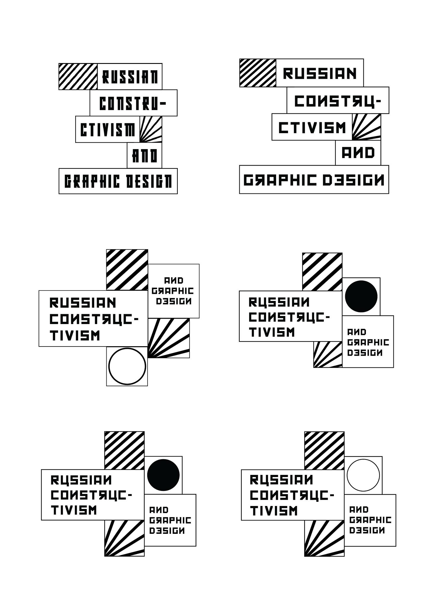
For project 1, we had to pick a topic from the ones given a make key artwork. The topic I picked was Russian Constructivism and graphic design. Before starting, I searched about the topic and also looks at many of the famous artwork for inspiration.
Fig.1.0 Inspiration
The first artwork I made was using photoshop. I used a font called "Konstrucktor" for all the writings. I tried combining different geometric shapes and simple color schemes for this design.
Fig.1.1 Design draft 1 (3/4/21)
For the second design, I tried using the architectural designs as inspiration for my design. I tried using the shapes present, such as the circle, triangle, and rectangles, to write my words around.
Fig.1.2 Image inspiration
Fig.1.3 Design draft 2 (3/4/21)
After the feedback session from my peers and observing the feedback my peers received for their work, I realized that my design was definitely not a logo and I should try again. Therefore this time, I did more research and look at various different art styles in Russian constructivism, and I realized their use of geometric shapes and cubism. I tried applying this in my design.
Fig.1.4 New designs 1 (9/4/21)
Fig.1.5 New designs 2 (9/4/21)
Fig.1.6 New designs 3 (9/4/21)
I tried various different styles and work in black and white first before trying to apply color. In some, I added the more commonly used shapes such as the red and black diagonal lines also the use of circles and squares. I asked my family and friends for feedback, and most of them likes design number five. So I tried taking design five and developing it a bit more as I felt the shape could be better.
Fig.1.7 Design development (9/4/21)
I tried using a mixture of squares and rectangles to fit all the text, and for the typeface, I changed it to a font called Kremlin as I felt it went better with the shapes I am using. Next, I just played around with different layouts and looks that looked better. In the end, I decided to use the second last design as I felt the layout was more balanced. After fixing some of the alignment issues, I started working on the color version.
Fig.1.8 designs color (9/4/21)
In Russian Constructivism, artworks mostly use colors such as red, black, white, and cream. I wanted my design to have a more modern look, so I tried using different colors. For example, instead of red, I tried using magenta instead of the cream color, I tried using a bright yellow. However, I kept the black and white to help identify some of the original works in Russian constructivism.
In the end, since the colors weren't really working, I tried a few more different colors, this time, I kept the color scheme more similar to the original constructivism.
Fig.1.9 designs color (9/4/21)
– Final Outcome –
Fig.2.0 Final Task 2A Black and White (10/4/21) -jpeg
Fig.2.1 Final Task 2A Colour (10/4/21) -jpeg
Fig.2.2 Final Task 2A (10/4/21) - pdf
Task 2B
The second part of project 1 was to create a poster using the key art we made in the first part of the project. Since my designs consisted of many squares and rectangles, I decided to continue that pattern in my poster design. For my design, I try to follow modular transition, and one of my ideas was to make it looks like a matrix or Tetris since constructivism did borrow ideas of futurism in their work.
Fig.2.3 Poster design draft 1 (15/5/21)
Fig.2.4 Poster design draft 2 (15/5/21)
Fig.2.5 Poster design draft 3 (15/5/21)
Fig.2.6 Poster design draft 4 (16/5/21)
Out of the various design I tried out, I got feedback from my family and eventually picked design #4, so I developed that poster design. I tried to align all the text within the modular system and used Gill Sans Std as the font, paired with the Kremlin font I previously used in my key art.
Fig.2.7 Final Poster Design (16/5/21)
After some feedback, I fixed whatever needed to be fixed on the poster and started working on the collaterals. The collaterals I picked were a t-shirt and phone covers. Since we had to keep the designs similar to the poster I used the same grid design with the keep art and used the same boxes to write the information.
Fig.2.8 T-shirt Design (27/5/21)
Once I was done with the t-shirts designs I started designing the phone covers. One of the phone cover designs I kept the same as the t-shirt and just added an extra box where a name can be added to customize the phone cover. The second phone design was just an iteration of the original design. I changed the layout slightly.
Fig.2.9 iPhone cover Design (28/5/21)
The next thing we had to do for task 2B was to animate the poster I looked at Pinterest and Behance for some animation inspiration and selected a few that I thought would go with my design.
Fig.3.0 inspiration (28/5/21)
Fig.3.1 inspiration (28/5/21)
The first gif I made was just for practices and to see what possible ideas I could come up with. I used photoshop for the first gif and just played around with the layer visibility.
Fig.3.2 gif draft 1 (29/5/21)
The second gif I made was using after effects, where I tried to animate the block like a block sliding game, because the size was smaller than the poster I had to change the layout a bit. Before animating it I made a prototype using paper so I could figure out the path each block of information would take. Since I am not very good at this game my sister had to help me.
Fig.3.3 gif planning (29/5/21)
– Final Outcome –
Fig.3.4 Final Poster- JPEG (31/5/21)
Fig.3.5 Final Poster Mockup- JPEG (31/5/21)
Fig.3.6 Final Collateral 1 Mockup- JPEG (31/5/21)
Fig.3.7 Final Collateral 2 Mockup- JPEG (31/5/21)
Fig.3.8 Final Task 2B- PDF (31/5/21)
Fig.3.9 Final Gif- JPEG (31/5/21)
Feedback
Week 6:
General Feedback: Start by designing in black and white. The color. is a distraction. It's a key artwork that functions as a logo. Initial key artwork should not include a background. When it comes to colors, less is more, but then again, it does depend on the event you are working with.
Specific Feedback (Peer feedback): The design doesn't look like a logo. It rather looks like a poster. They suggested I could use a few of the shapes to make it look more like a logo.
Week 7:
General Feedback: The key artwork should stand alone, and it should work in black and white first before you move on to color. The name and the form have equal importance, so always add the event's full name on the logo.
Specific Feedback (Mr.Vinod): The design works and for the color, maybe try the same magenta colors with the red stripes so that it works together and gives it a more modern look.
Week 8:
Individual Learning week
Week 9:
General Feedback: When you are designing something like a ticket consider the point size and that the style of the layout and typography is similar to your poster.
Specific Feedback (Mr.Vinod): The construction is well done so good job on that. Try to see if you can use different fonts such as universe for your body text and try to keep the point size to 16 -22. Also the line in the middle of the names and the timing, I am not sure if it's very necessary, just try and see.
Week 10:
General Feedback: For your specialization pick something that you want, don't base it on what people say or sell o you. Have a clear understanding of what specialization is all about. You cant just copy-paste your key artwork in your collaterals. You need to expand on your key artwork designs.
Specific Feedback (Mr.Vinod): The gif is interesting to look at so good job o that. The T-shirt design can be more experimental. I think you can try different variants from the key art.
Week 6:
Experience: This week's project was a very time-consuming task because I had to start over again, and this time, I tried as many design styles as I could. I had. Hard time deciding which style to go with, so I had to ask the opinions of my friends and families. I wasn't really happy with most of them.
Observations: I realized when working in color after black and white, some of my designs didn't work anymore. I had difficulty deciding which parts to keep black and white and which parts to color.
Findings: I found that the designs I thought were impactful didn't really do anything for others. So I tried to get as much feedback as possible to improve my design and use my intuition to make it unique.
Week 7:
Experience: Making the poster was quite a bit of fun. I was really allowed to be creative, and working on the big page of A2 allowed me to experiment more with what I wanted. It was less stressful than coming up with the key artwork because I now had a foundation that I could follow and design around.
Observations: I tried to reimagine Russian constructivism as I read in many articles that constructivism is more on the artist interpretations. I felt the poster of Russian constructivism I saw always use the same pattern, designs, and colors, so I really wanted to try out something different.
Findings: Constructivism has influenced all sorts of art such as music, film, poetry, especially architecture, ceramics, and theater. I am glad I read more on the constructivism topic as I got to learn this otherwise, I would have been left believing constructivism is only about art and typography.
Week 9:
Experience: This week, we had quite a few things to compete but having the poster done made it easier to design the collaterals because I tried to base my designs around it. Unfortunately, the animated poster took the most time because the size of the layout had to change from A1 to a square shape. In addition, this page layout was a bit difficult to work around because my poster design was originally a rectangle. However, I did manage to come up with a design I was happy with.
Observations: For my collateral design, I've noticed that I've been relying on the grid design more frequently. I was concerned that this grid design might be misconstrued for part of the key art, so I tweaked it in my collaterals.
Findings: Using the same color scheme throughout my collaterals and poster not only made the designing process much easier, but it also gave all the collaterals a sense of unity.
Further Reading
Fig.1.0 Article about Russian constructivism
Russian constructivism was a movement in art, design, and architecture that began in Russia in 1913 but rose to prominence during the 1917 Revolution. Russian constructivism is considered more of a philosophy than a just-style. I reflected on the beliefs in art for social change.
- Usage of photomontage, strong typography, minimal colors such as red, black, and yellow.
- Diagonal elements with circular and angle type.
- geometric shapes
Fig.1.1 Article about Russian constructivism
https://www.widewalls.ch/magazine/russian-constructivism
- Russian Constructivism was the last and most influential modern art period to flourish in Russia in the 20th-century.
- Vladimir Tatlin focused on the technical analysis of modern materials and believed that art should not be produced for the art’s sake but as a practice for social purposes.
- Constructivism borrowed the ideas of Cubism and Futurism.
- Constructivism was a style of art and design that emphasized materials, scale, revolution, and structure.
- The geometrically formed units reflected the dynamism of modernity, and Tatlin concentrated on using basic materials for modern construction such as glass and steel.
- Varvara Stepanova and Ilya Chashnik were ceramic artists who used abstract planar forms in their work and repeated abstract patterns in textile design.
- Graphic design, propaganda poster design, and typography is credited to El Lissitzky and Alexander Rodchenko.
Fig.1.2 Article about Varvara Stepanova
https://www.moma.org/artists/5643?=undefined&page=&direction=
"Constructivism"—the name that Stepanova and her fellows gave to the new art. Its meaning "is a movement away from representation and contemplation toward activity and production." Varvara was a painter, photographer, and designer. Cubism and the Futurist art movements influenced her work. She devoted her entire career to attempting to use her work to effect revolutionary change in society.
Fig.1.3 Varvara Stepanova, 1924


Comments
Post a Comment